
The brief
P&B Electrical is a PAT testing business based in Manchester, operating across the UK and Northern Ireland. The client — a friend — came to me for a single-page website to promote the business. There was no existing branding, colour system, logo, or visual identity to work from; I built the entire brand from scratch alongside the site.
The challenge
The obvious approach here would have been to pick a local-services Elementor template, drop the client’s copy into the existing colour scheme and font stack, and call it done — that’s what “template + logo swap” usually looks like for a one-page trade site. The real problem was that a generic template look would undersell a business whose whole value proposition is trust: PAT testing is a compliance service, and the site’s job is to make a nationwide operator with UK-wide reach look credible to two different buyers at once — commercial clients (offices, schools, factories) who care about consistency and minimal disruption to operations, and landlords/letting agents who care about compliance and liability. Neither audience is won over by a stock template with placeholder-feeling colours. So the challenge wasn’t “build a page,” it was “build a brand system convincing enough that a one-page site reads as an established, professional operation” — which meant treating colour, type, and every section’s copy hierarchy as deliberate decisions, not template defaults.
What I built
- Full brand system from nothing: five-colour palette (Midnight Navy
#0D1B2Aprimary, Warm Gold#C89B5Faccent, Cream White#F5F1EBbackground, Slate#3D4F5Fbody text, Light Grey#E8EDF2section backgrounds), set as Elementor Global Colours - Custom SVG logo: lightning bolt mark inside a rectangle, paired with a DM Serif Display wordmark, iterated across three rounds (sharper bolt geometry, matched typeface, glyph height aligned to text height) — exported as SVG for the live logo, 512×512px PNG favicon, 1200×630px PNG for Open Graph sharing
- Typography system: DM Serif Display for headings, DM Sans for body/UI, both Google Fonts, applied via Elementor Global Fonts
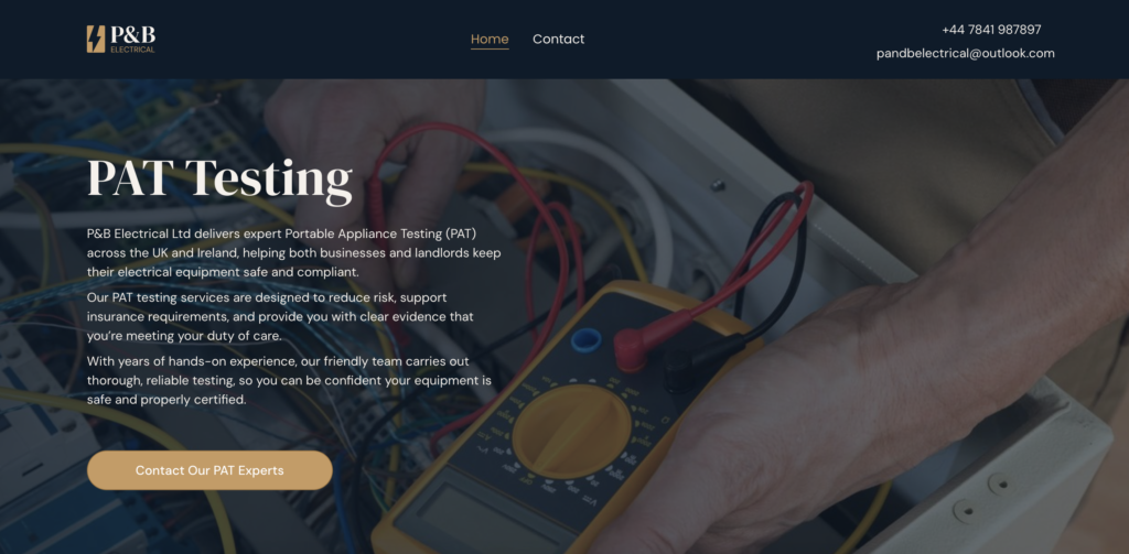
- Hero section: full-width background image with a navy-to-transparent gradient overlay for text legibility
- “Who Needs PAT Testing?” section: navy card listing target customer types (landlords, offices, schools, hotels, construction sites) — directly addressing the dual-audience problem
- “Areas We Cover” section: UK/Ireland map graphic reinforcing nationwide reach from a Manchester base
- Testimonial section: 10 real client testimonials (TWA Group, Fusion Electrical, UL International, HMG Paints, and others) — used as the primary trust signal in place of star ratings or review-widget plugins
- FAQ accordion: covering legal requirements, testing frequency, cost, and certification — written to pre-empt the compliance questions both audience types actually have
- Mobile header fix: custom CSS in Elementor Site Settings to correctly hide the desktop text (phone/email) on mobile and right-align the icon-only version
Problem-solving highlights
- Global colours/fonts not applying to template widgets. After setting up Elementor Global Colours and Fonts, several headings kept rendering in the template’s original typeface. This was because the local-services starter template bakes font and colour values directly into individual widgets rather than inheriting from globals — globals only apply automatically to new widgets, not existing ones. I found this by testing a fresh widget (which picked up the global correctly) against an existing one (which didn’t), isolating it to a hardcoded override rather than a settings error. Fixed by going widget-by-widget through the Typography style panel and clearing the hardcoded font-family field via the pencil/expand icon so it fell back to the linked global.
- Mobile header layout broke even after hiding the desktop text. On mobile, I’d already used Elementor’s responsive visibility control to hide the phone/email text next to the icons — but the icons still wouldn’t push fully right. This was because Elementor’s “hide on mobile” toggle removes the element visually but leaves it in the flex flow, so the invisible text container was still claiming layout space. I diagnosed this via DevTools, inspecting the icon element and tracing up to find it sat in a separate flex container from the text rather than a shared parent — which is why the icons ran across normally while the hidden text collapsed on top of itself instead of disappearing cleanly. Fixed with two lines of custom CSS scoped to
max-width: 767px:display: none !importanton the text container (fully removing it from flow, not just hiding it) andmargin-left: auto !importanton the icons container to push it right. - Risk of the mobile fix breaking desktop. Because Elementor Theme Builder uses one shared template across breakpoints rather than separate mobile/desktop layouts, there was a real risk that editing the header for mobile would alter desktop behaviour too. I resolved this by keeping the fix strictly to a media-query-scoped custom CSS rule placed in Site Settings → Custom CSS (rather than the WordPress theme customiser, to keep it independent of any theme change) — so the override only ever fires below 767px and desktop’s shared template stays untouched.
The outcome
The client had no digital presence at all before this — no site, no logo, no consistent branding across quotes, WhatsApp contact, or word-of-mouth referrals. The site is now live at pandbelectrical.com, giving a business that’s operated for years on reputation and repeat commercial contracts (some testimonials cite 7+ year relationships) a first proper online front door — one that presents that same credibility visually, with a logo, colour system, and trust section built around the real client testimonials rather than generic stock content.
Why one page, not multi-page
A multi-page site (separate Services, About, Areas Covered pages) would have been the more conventional approach for a business covering this many customer types and regions. I kept it to one page because the actual customer journey here is short — landlords and facilities managers searching “PAT testing [town]” want proof of legitimacy and a fast way to get a quote, not a multi-click site architecture. A single, well-structured page with clear section hierarchy (what PAT testing is → who needs it → proof via testimonials → coverage area → FAQ → contact) covers every objection in one scroll and keeps the conversion path — call, WhatsApp, or email — to a single click from anywhere on the page.